
What Is Japandi Style?
Japandi is the meeting point of Japanese minimalism and Scandinavian warmth — two design philosophies that, on the surface, come from opposite corners of the world but share the same instinct: less, but better. Japanese wabi-sabi values imperfection and quiet restraint. Scandinavian hygge values comfort and natural materials. Put them together and you get interiors built around calm, uncluttered space, muted natural tones, and objects chosen with intention rather than filled in for the sake of it.
Wall art in a Japandi home isn't decoration in the traditional sense — it's a focal point. A single well-composed piece does more work than a gallery wall of six. That's exactly where fine art photography fits: a landscape or black-and-white print brings depth and atmosphere to a room without adding visual noise, which is the opposite of what busy, saturated art does in this kind of space.
Why Photography Works So Well in Japandi Interiors
Photography, especially landscape and black-and-white work, tends to have a natural stillness to it — open skies, quiet compositions, soft gradients of light. That stillness is exactly the mood Japandi rooms are built around. Unlike bold graphic prints or brightly colored art, a photograph can hold a room's attention without competing with the furniture, the wood tones, or the neutral palette Japandi spaces are known for.
Material choice matters here too. Fine art paper and canvas both have a matte, tactile quality that suits the natural-materials feel of Japandi — think linen, raw wood, stone. A glossy or metallic print can feel closer to a "statement" piece in a more maximalist room, but for Japandi, the quieter finishes tend to work better.
Landscape Photography for Japandi Spaces
Landscape prints bring in soft, muted tones and a sense of open space — mountains fading into mist, quiet coastlines, wide skies with minimal color saturation. These qualities echo the calm, breathing-room feel Japandi interiors are built around. A landscape print works especially well above a low sideboard or bed frame, where the horizontal lines of the photograph mirror the horizontal lines of the furniture — a small detail, but it's part of why some prints "sit" in a room better than others.
For a Japandi living room, look for landscapes with a limited color palette — greys, soft blues, warm neutrals — rather than anything with strong contrast or saturated color.
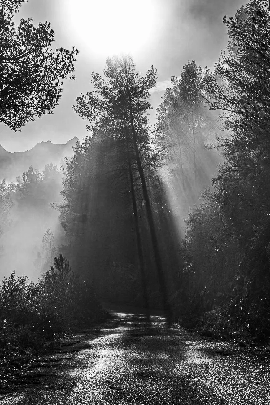
Black and White Photography for Japandi Spaces
Black and white prints strip a photograph down to its essentials: light, shadow, texture, form. That's very much in line with the Japandi instinct to remove what isn't necessary. Because there's no color to consider, a black-and-white print is one of the easiest ways to add depth to a room without any risk of clashing with existing tones — it sits comfortably next to warm wood, white walls, or muted textiles alike.
Black and white also tends to read as slightly more architectural or graphic than color landscape work, which makes it a strong choice for a study, hallway, or entryway — spaces where you want a print to feel considered rather than soft.
How to Style Japandi Wall Art
A few practical guidelines that make a real difference once the print is on the wall:
Size relative to the wall. As a rough rule, a print should cover roughly two-thirds of the width of the furniture beneath it — a sofa, bed, or console table. Too small and it looks like an afterthought; too large and it overwhelms the quiet feel Japandi is going for.
One statement piece over a cluster. Japandi favors a single, well-placed print over a gallery wall. If you do want more than one, keep it to two prints with generous space between them, rather than a tight grid.
Framing. A thin wood frame (oak, walnut, or a light natural tone) reinforces the Japandi material palette better than a glossy black or ornate frame. Frameless or float-mounted prints also work well for a more minimal look.
Placement. Eye level, roughly 145-150 cm from the floor to the center of the print, is the standard guideline — though in a room with low furniture, hanging slightly lower so the print relates to the furniture beneath it often looks more intentional.
Frequently Asked Questions
What colors work best in Japandi interiors?
Muted, natural tones — soft greys, warm beige, dusty blue, and black and white — tend to fit best. Bright or highly saturated colors work against the calm feel Japandi is built around.
Is black and white photography Japandi-appropriate?
Yes — arguably more so than color work, since the absence of color removes any risk of clashing with the room's palette and reinforces the minimal, considered look Japandi favors.
Can I mix a landscape print with a black and white print in the same room?
Yes, as long as there's enough visual breathing room between them. Two prints with different subjects but a similar tonal quietness will sit better together than two very different, high-contrast pieces.