
Browse by category: Black & White · Landscape · Wildlife · Flowers ·
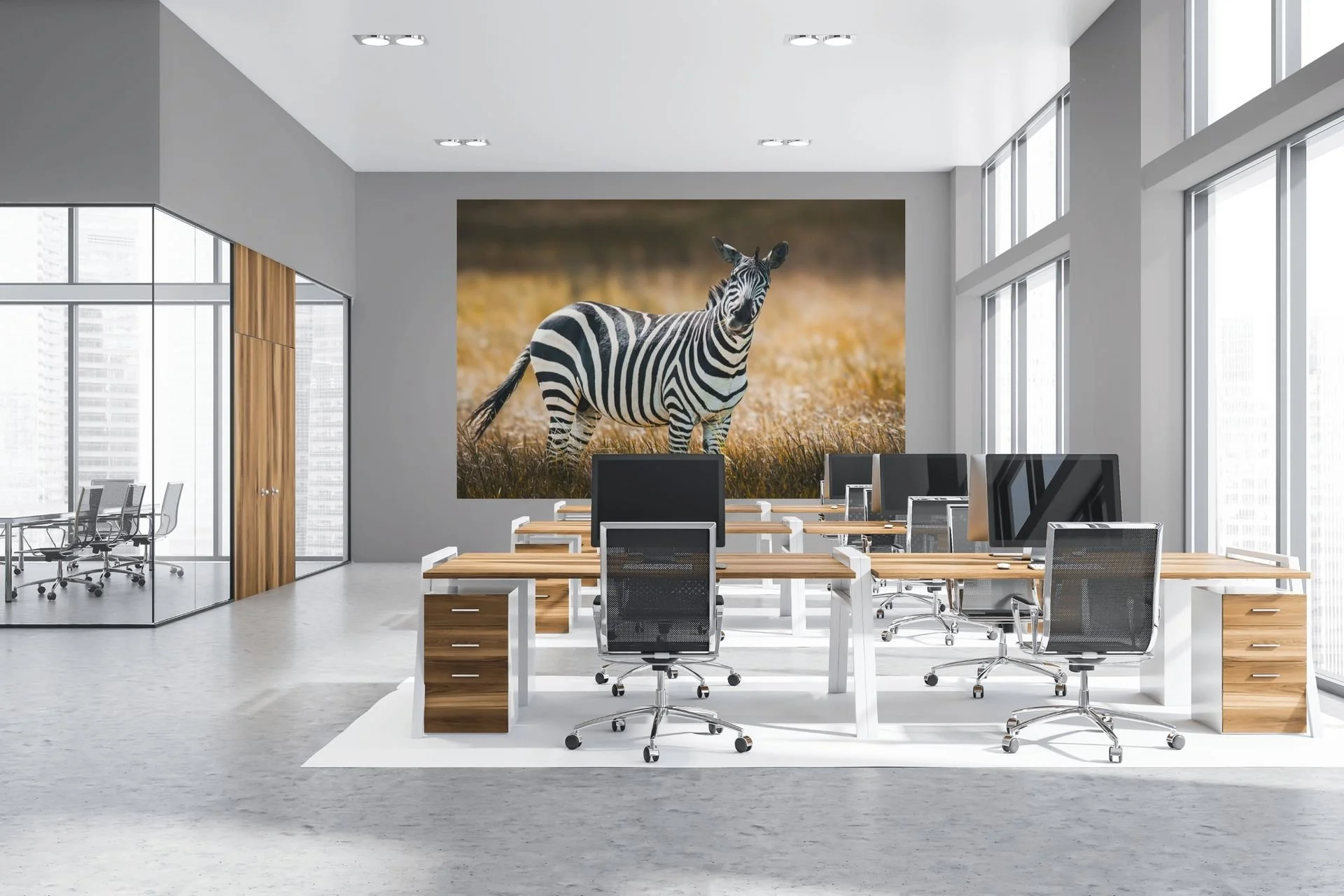
Calm Beats the Standard Poster
Walk into almost any office and you'll usually see one of two things: bare white walls, or a motivational poster with an eagle and a quote about "success." Both miss the same thing — a reason to look twice.
Walk into almost any office and you'll usually see one of two things: bare white walls, or a motivational poster with an eagle and a quote about "success." Both miss the same thing — a reason to look twice.
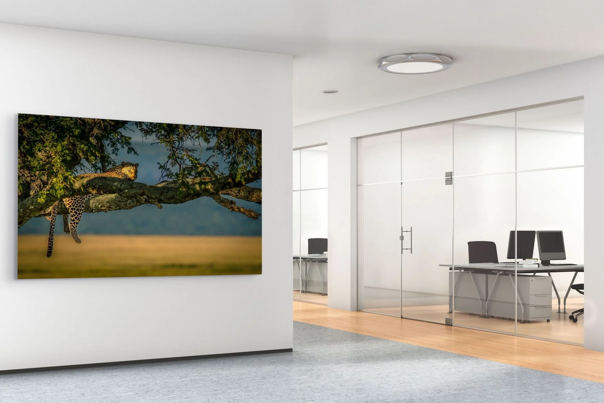
A calm, natural subject sets the tone the moment clients walk through the door.
More and more businesses are choosing something else instead: nature photography and calm, atmospheric imagery on the wall. Not because it's trendy, but because it works.
Why Nature Imagery Belongs in the Workplace
Research into biophilic design — the idea that people function better in spaces that reference nature — has shown for years that calm, natural imagery contributes to lower stress and better focus. For an office, that's directly relevant: less distraction, a more pleasant atmosphere for employees, and for visitors or clients, a space that leaves a stronger impression than a standard fit-out.
This isn't about grabbing any landscape poster at random. The right choice depends on the type of space.
Which Style Fits Which Office
Minimalist or Japandi Office
Clean lines, little color, lots of white and wood. Here, a black-and-white landscape or a quiet botanical close-up works best — subtle, with nothing competing with the interior.
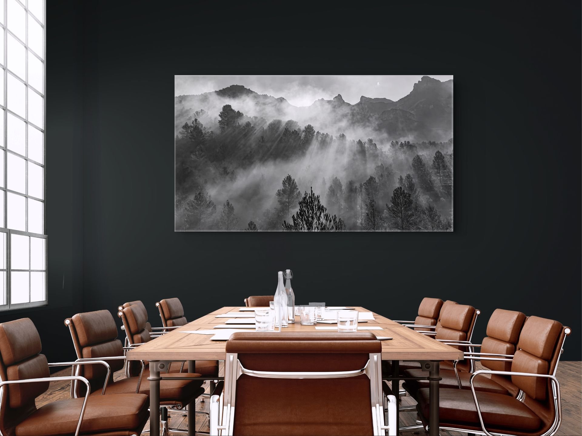
A calm black-and-white landscape suits a minimalist or Japandi-style meeting room.
Creative or Open-Plan Workspace
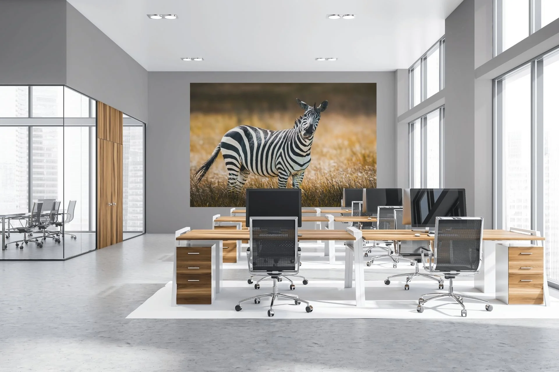
A zebra print adds color and personality to an open-plan office without disrupting focus.
More room for color and a statement piece. Think of something more abstract, or a print from an AI fine art series — something that sparks a conversation without disturbing the calm. Check our Statement Wall Art Page for more information.
Reception or Waiting Area
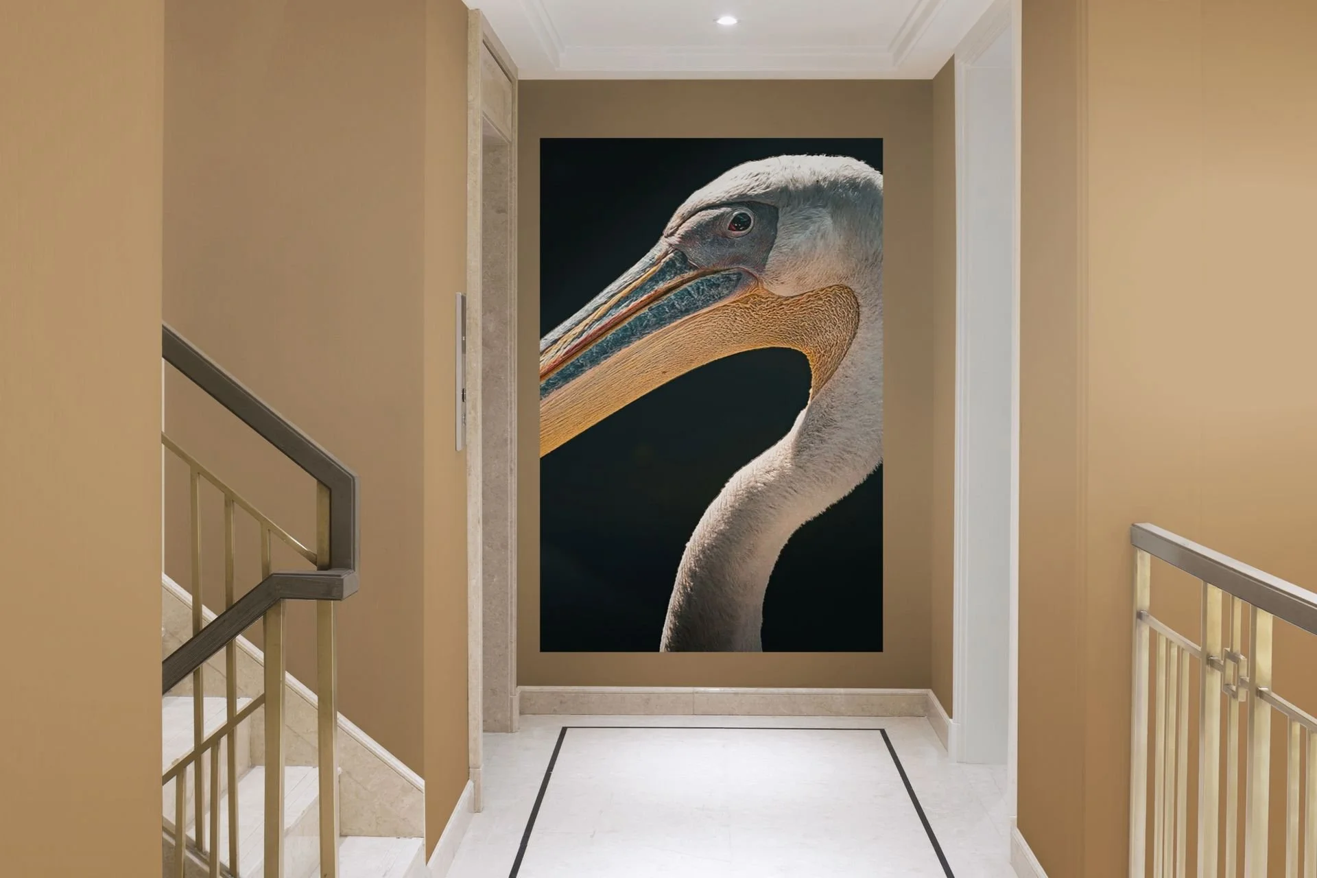
This is where large format makes the difference. One calm subject — a mountain landscape, water, a forest scene — in a large size has more impact than three small prints side by side.
Size and Placement
The same rule of thumb that applies at home largely applies at the office: a print should be large enough to fill the wall, not just "hang on it." Above a sofa or waiting bench, hang a print at the eye level of someone seated. In a meeting room, you can go larger and more dominant, since the viewing distance is greater.
Choosing the Right Material — Not Just Looks, but Maintenance
Offices deal with different conditions than homes: more foot traffic, more dust, sometimes more light through large windows. A print on aluminum (dibond) or acrylic is often a better choice than canvas — easier to clean, less prone to fading in sunlight, and the finish looks a touch sharper and more professional.
Why a Fine Art Print Makes a Difference
An office poster feels like an office poster. A carefully chosen print feels like a deliberate choice. For businesses that host clients, and for architects and interior designers, that's often exactly the point: it signals that thought went into the space, rather than "we needed something on the wall."
In Short
The right wall art for an office isn't about adding decoration — it's about making a choice that fits the space, the people working in it, and the impression you want to leave on whoever walks through the door. Calm and nature tend to work better than clutter and clichés.
Looking for the right print for your office or practice? Get in touch for tailored advice, or browse the collection.

What size wall art fits your wall? The complete sizing guide
A print that looks bold on your screen can disappear on a large wall. How to pick a size that fits your wall and room, and avoid the most common mistake: going too small.
You found the perfect photo. Big on your screen, it's striking — the detail, the color, the mood. You order a print, hang it up... and somehow it disappears against the wall. Not because the photo isn't good, but because the size doesn't work.
This is the most common mistake when buying wall art: sizing too small. A print that feels bold on your phone or laptop can turn into a postage stamp on a three-meter-wide living room wall. It's an easy regret to avoid — once you know what to look for.
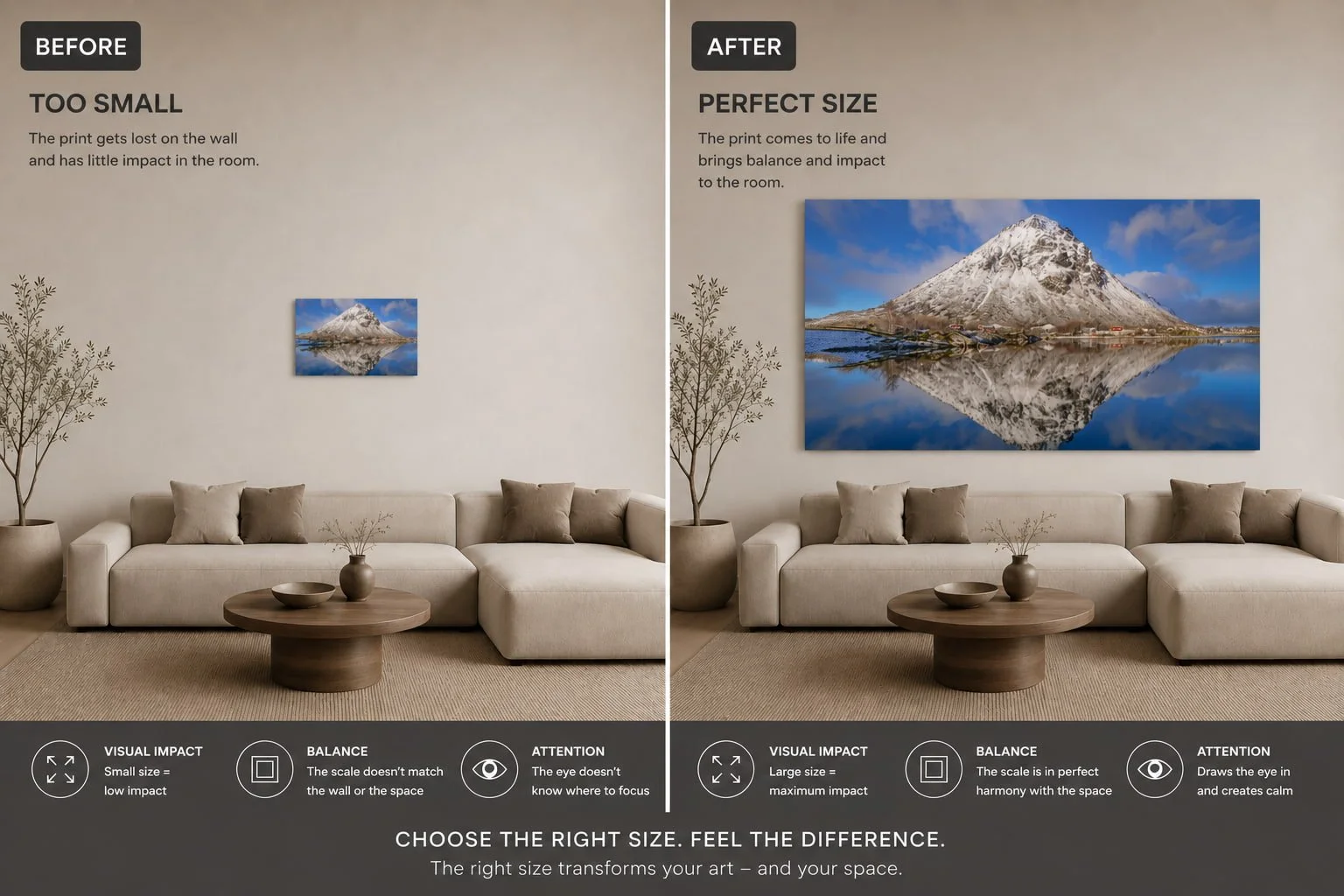
Why size matters more than anything else
Of all the choices you make when buying a print — material, color, style — size has the biggest impact on how a piece feels in a room. Too small, and it becomes decor you stop noticing after a week. The right size becomes a statement: something your eye is drawn to, that brings calm or energy to the room.
The difference rarely comes down to the photo itself. It comes down to scale.
The basic rules of thumb
A few simple guidelines will get you most of the way there, even before you pick up a tape measure:
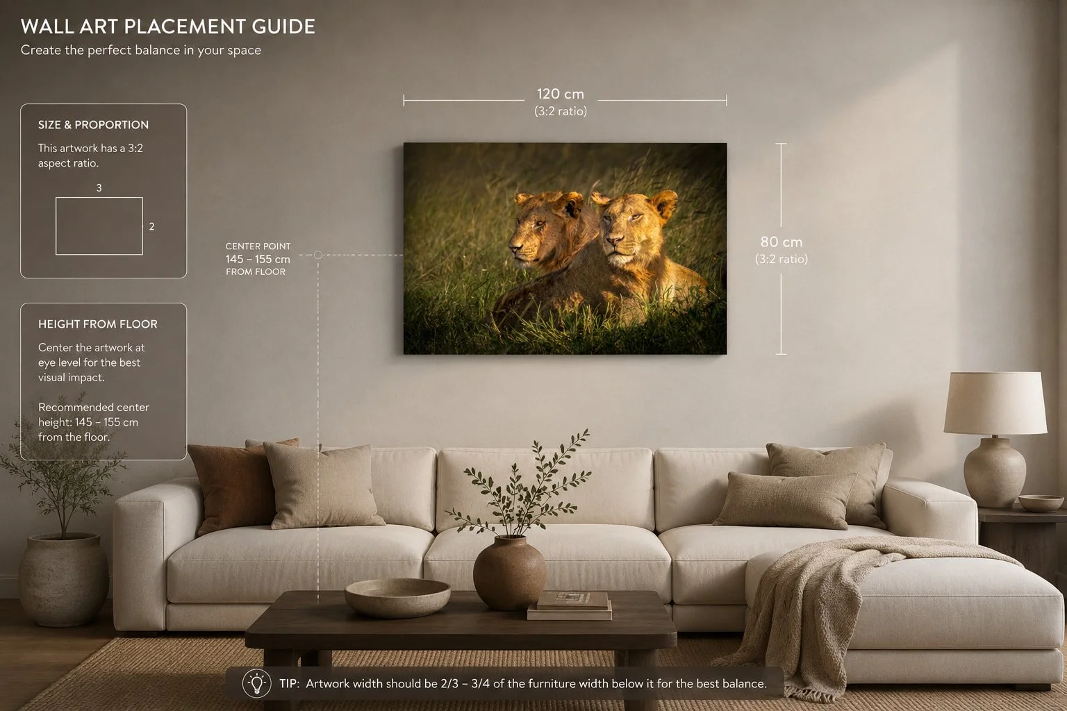
Above a sofa or console table: aim for a width around two-thirds to three-quarters of the furniture below it. Too narrow and it looks lost, too wide and it overwhelms.
Eye level: the center of your print should sit around 145–155 cm from the floor — standard gallery height. Above a sofa, a touch higher works, since you're usually viewing it seated.
Wall coverage: a print filling roughly 60–75% of the available wall space feels balanced. Less, and the image gets lost. More, and it can start to overpower the room.
These rules are a starting point, not a strict formula — but they'll help you avoid the two most common mistakes: sizing too small, and hanging too low.
The subject of the photo matters too
Size isn't only about wall width. What's actually in the photo plays just as big a role in what size works.
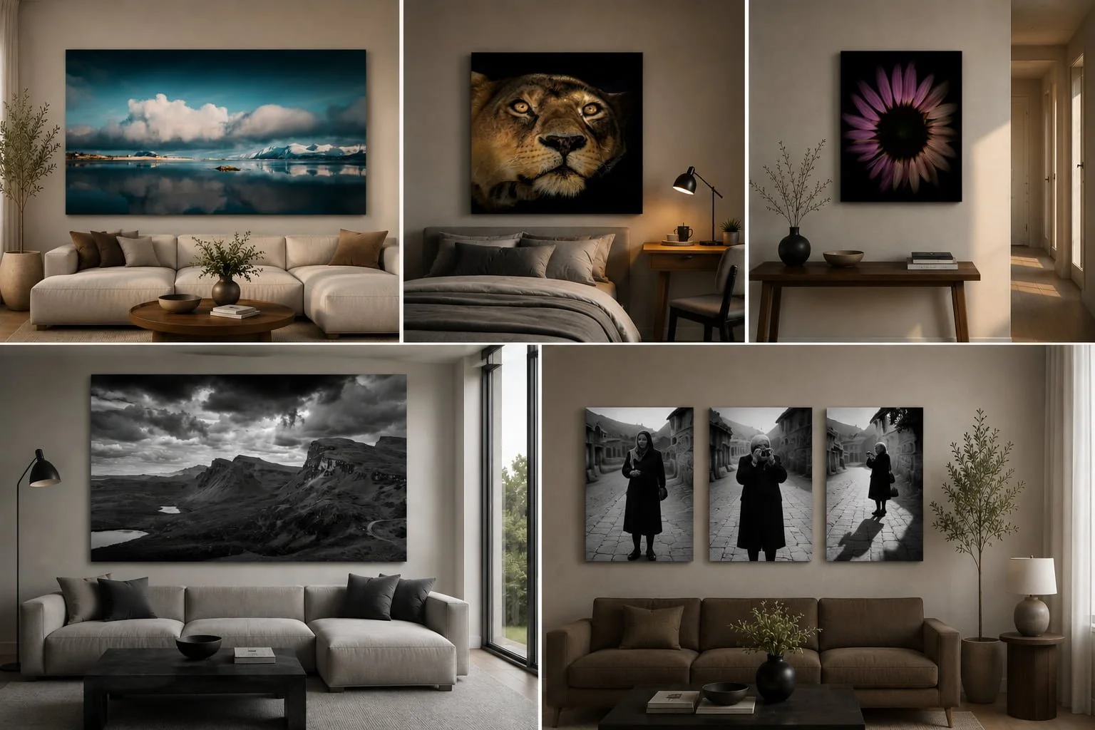
Wide, open landscapes — a misty fjord, a quiet plain — need room to breathe. Too small, and that sense of openness gets lost. These pieces actually get stronger the larger they hang.
Wildlife portraits with direct eye contact don't need that same space. A medium size often already carries plenty of impact — go too large, and a gaze that should feel captivating can start to feel confrontational instead.
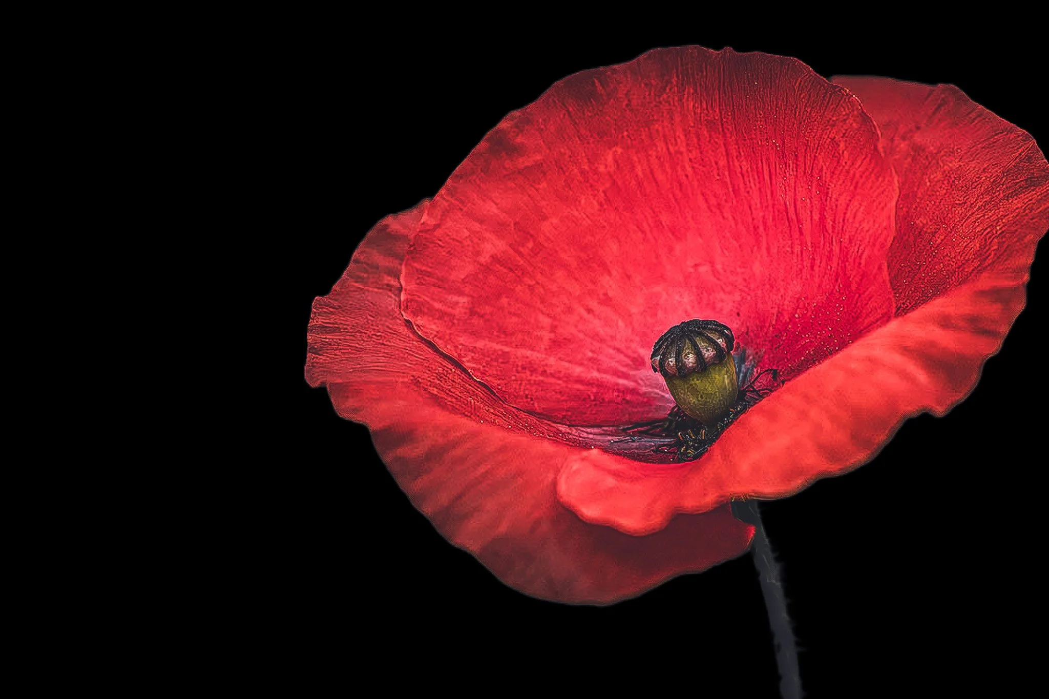
Macro shots, like a close-up of a flower, invite you to look closely. The detail is the draw, not the scale — these work well at a smaller size, for instance in a hallway or above a console table.
Minimalist black-and-white images with a lot of negative space benefit from going large: the bigger the print, the stronger the sense of quiet.
Series, a set of related images, don't work as one large piece but as a group of smaller sizes hung together — the impact comes from repetition and spacing, not from individual scale.
The right size for each room
The same photo can call for three different sizes in three different rooms:
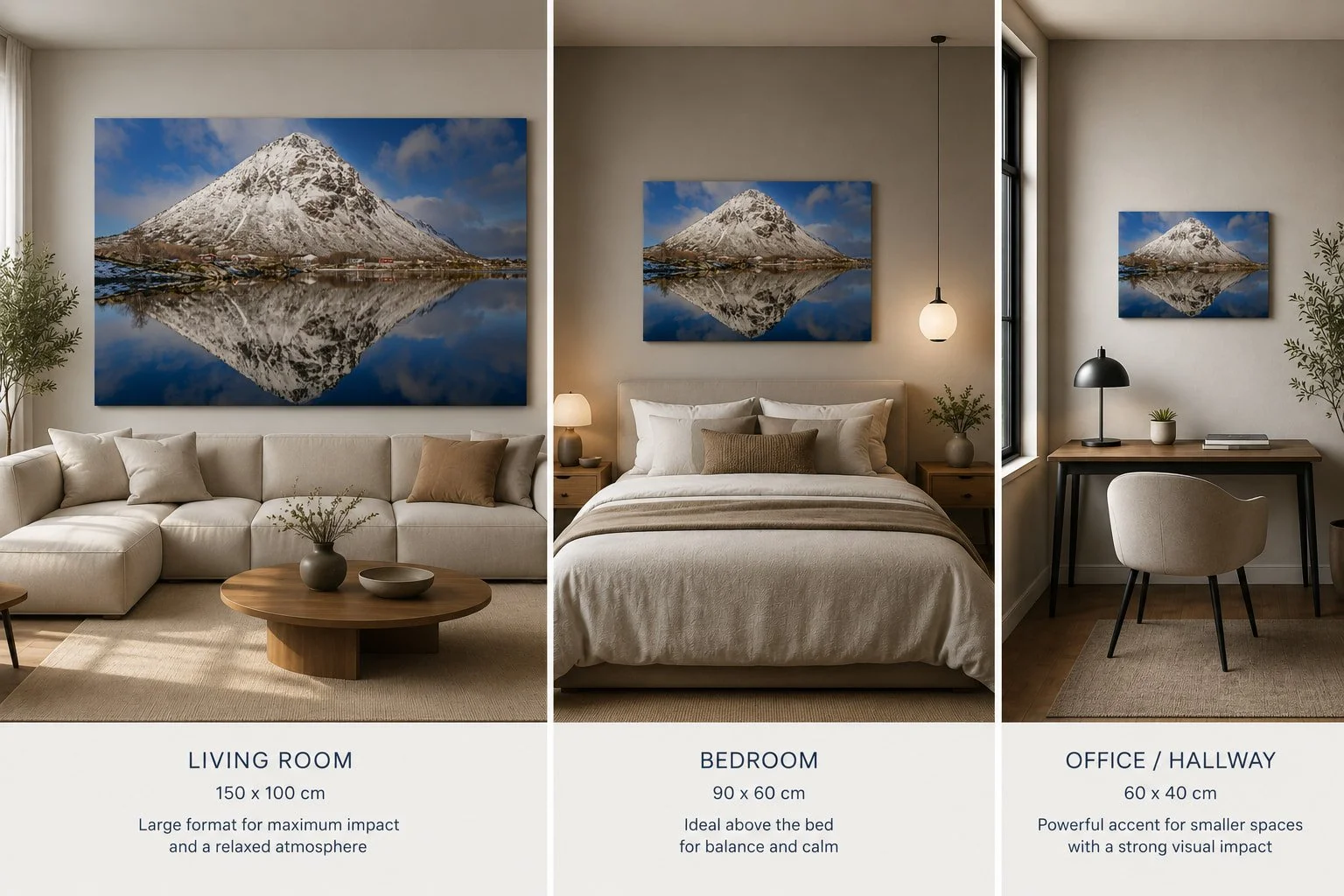
Living room: this is where you can think big. Above a sofa, a large size (150 x 100 cm or more) is often exactly what the room needs for a relaxed, cohesive feel.
Bedroom: above the bed, a slightly more modest size tends to work better — large enough to have presence, small enough to keep the room calm. Around 90 x 60 cm is a common starting point.
Office or hallway: these spaces often have less wall to work with, but that doesn't mean less impact. One strong piece at a smaller size (60 x 40 cm) can stand out more in a narrow space than a larger piece that doesn't fit.
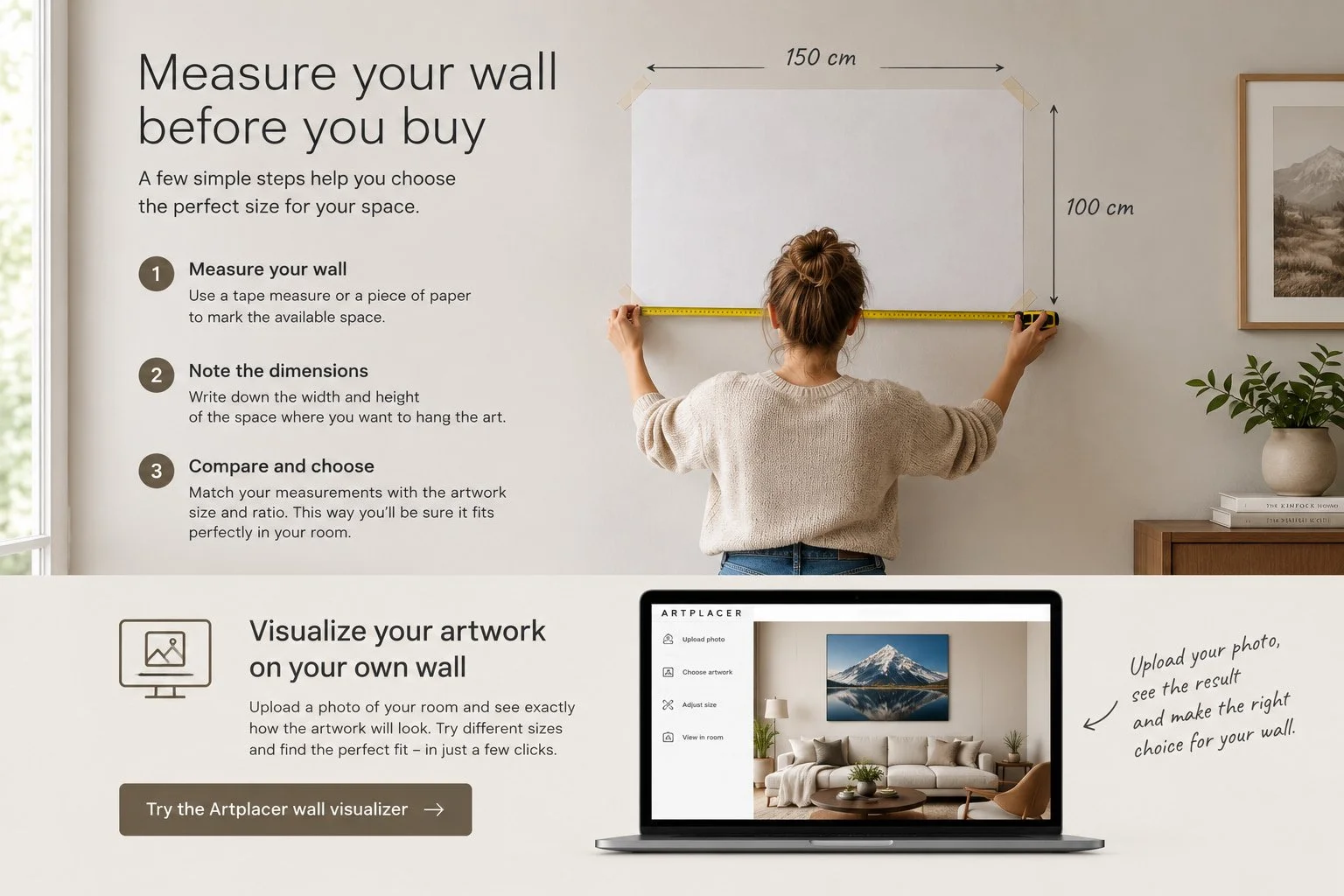
Measure your wall before you buy
Before choosing a size, grab a tape measure. It takes five minutes and saves you a return
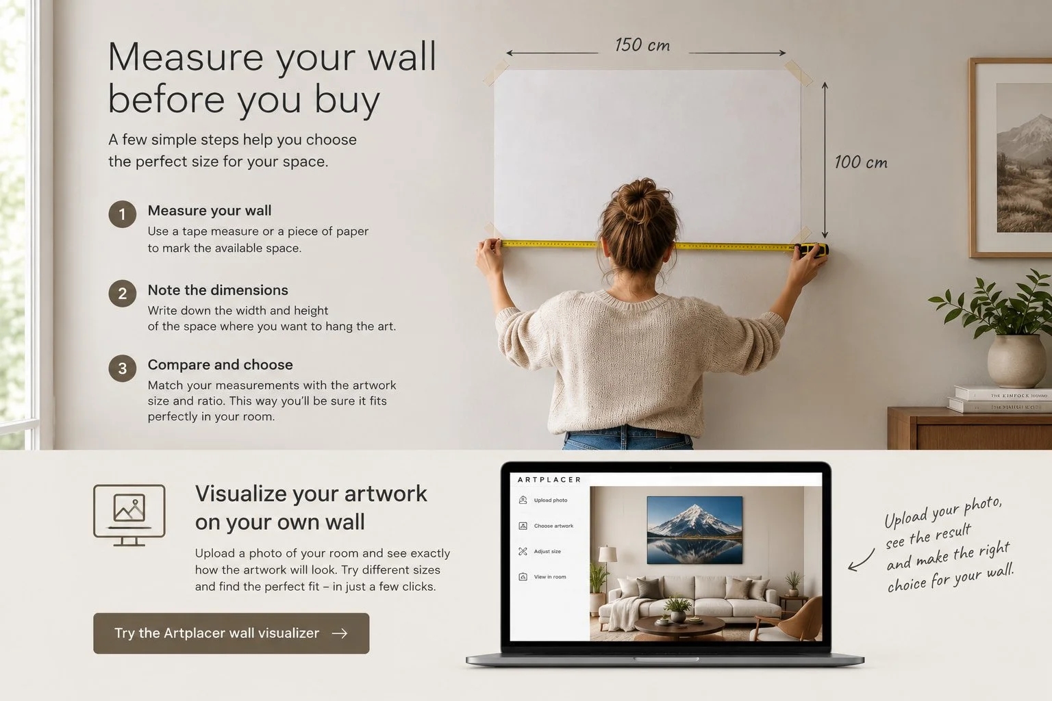
Use this link for Artplacer
Measure your wall. Use a tape measure, or tape a large sheet of paper to the spot where the print will hang, at the size you're considering.
Note the dimensions. Width and height of the available space, plus the height from the floor.
Compare and choose. Match your measurements against the sizes available — not against whatever the largest option happens to be.
Want to see exactly how a print will look on your own wall before you order? Upload a photo of your room to the [Artplacer visualizer] and preview different sizes in your actual space.
Material changes how large a print feels
There's one more factor that's easy to overlook: material and finish affect how big the same size actually feels on the wall.
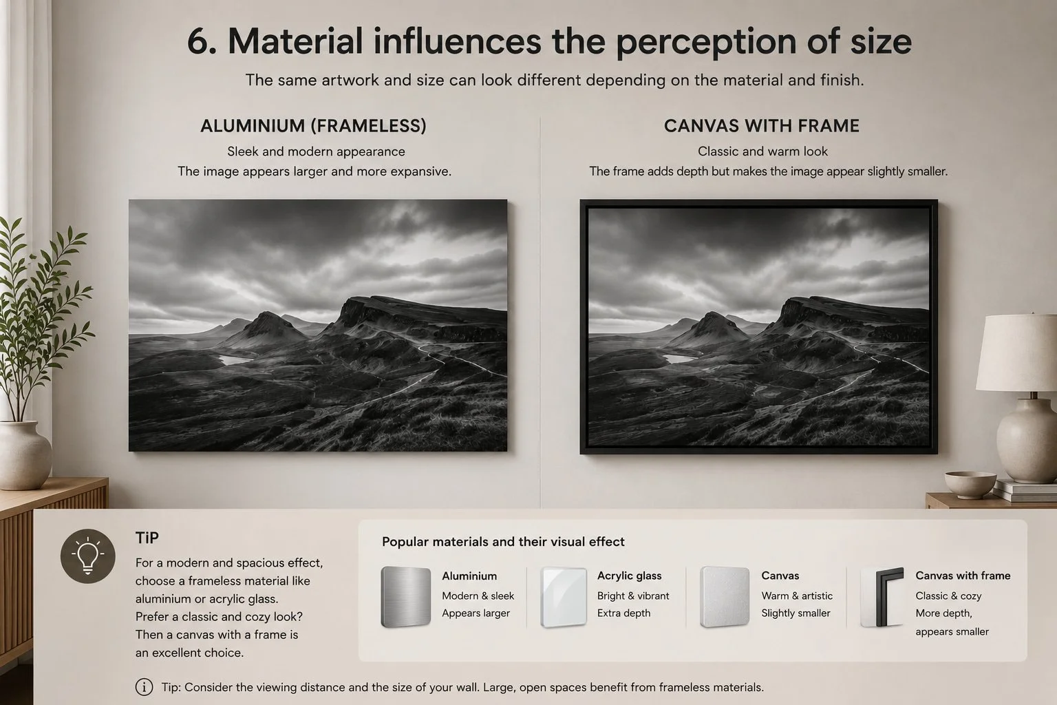
A frameless print on aluminum or acrylic runs edge to edge — the image fills the entire space it occupies, which reads larger and more modern. Canvas with a frame adds depth and a classic, warm feel, but the frame visually pulls the image inward, so the same size ends up reading just slightly smaller.
Neither is better — it comes down to the feel you're going for. In a large, open space, a frameless material tends to make the strongest statement. In a more classic, cosy interior, framed canvas fits naturally. (For more on the materials themselves, see our guide to print quality and materials.)
Choose deliberately, not by instinct
The right size for your wall art isn't about going as big as possible, or picking whatever happens to be available — it's a combination of your wall, your furniture, the subject of the photo, and the material you choose. Take five minutes to measure before you order, and you'll avoid the most common regret in wall art.
Working with clients on interior projects?
Visit our For Professionals page for tailored sizing and material advice.
Browse by category to find a size that fits your space:
Browse our other photo pages
Flowers - Landscape - wildlife - black & white - digital art
How to Choose Wall Art That Actually Fits Your Room
You found a photo you love. Now the real question is whether it fits your room. How to think it through, starting with the mood of the space.
You've found a photo you love. Now the real question: will it actually work on your wall?
This is the part people get stuck on — not whether they like a piece, but whether it fits the room. Here's how to think it through.
Start with the mood of the room, not the photo
Before you fall for a specific image, look at the room itself. Is it calm and quiet, or busy and lived-in? A minimalist bedroom with soft, neutral tones asks for something equally restrained — a misty landscape, a single tree in fog, a black and white study. Drop a high-contrast wildlife close-up into that same room and it fights everything around it, even if it's a beautiful photo on its own.
A living room with more personality — warm woods, layered textures, a bit of clutter and life — can carry bolder work. A dramatic sky, a sharp animal portrait, something with more energy and contrast.
The rule of thumb: quiet rooms want quiet images, busy rooms can handle bold ones. Mismatch the two and even great photography looks out of place.
Match subject to function, not just color
It's tempting to pick art purely by color — "this teal works with my sofa." Color matters, but subject matters just as much, because different subjects create different feelings in a room.
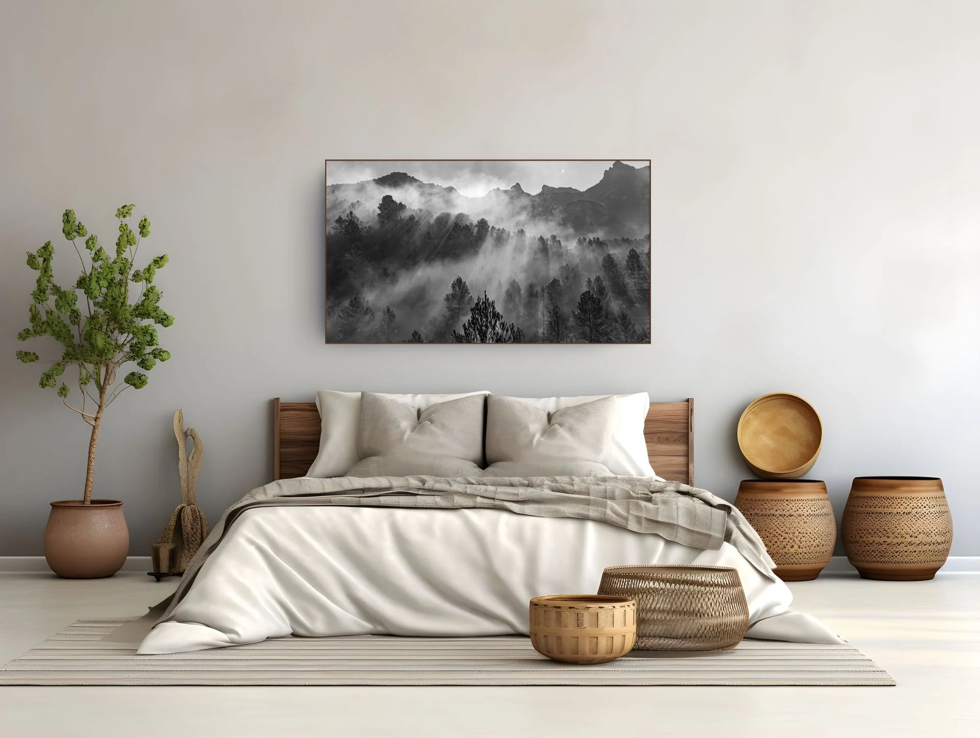
Bedrooms benefit from stillness: fog, water, minimal landscapes, soft black and white. You're not trying to impress guests here, you're trying to wind down.
Living rooms and entryways can take a statement piece — something with drama or scale that gives visitors something to look at.
Home offices often do well with subjects that feel focused rather than chaotic: architecture, clean landscape lines, structured compositions.
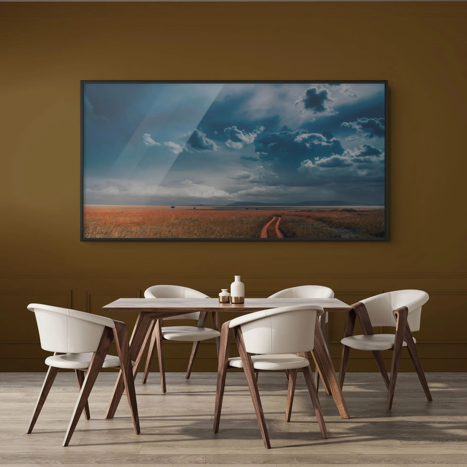
Dining areas can lean warmer and more textural, especially with black and white or earthy landscape tones that don't compete with the table itself.
Interior style is a shortcut, not a rulebook
If you know your interior style, it narrows the choice fast:
Japandi / minimalist — muted tones, negative space, black and white or soft landscape work. Nothing shouting for attention.
Scandinavian — light, airy, high-key images; snow, fog, pale skies.
Industrial / loft — bigger prints, more contrast, wildlife or architecture with strong lines.
Traditional / classic — timeless subjects, balanced compositions, warmer tones.
Eclectic / maximalist — this is where a bold, characterful photo can actually be the star of the room rather than something that needs to blend in.
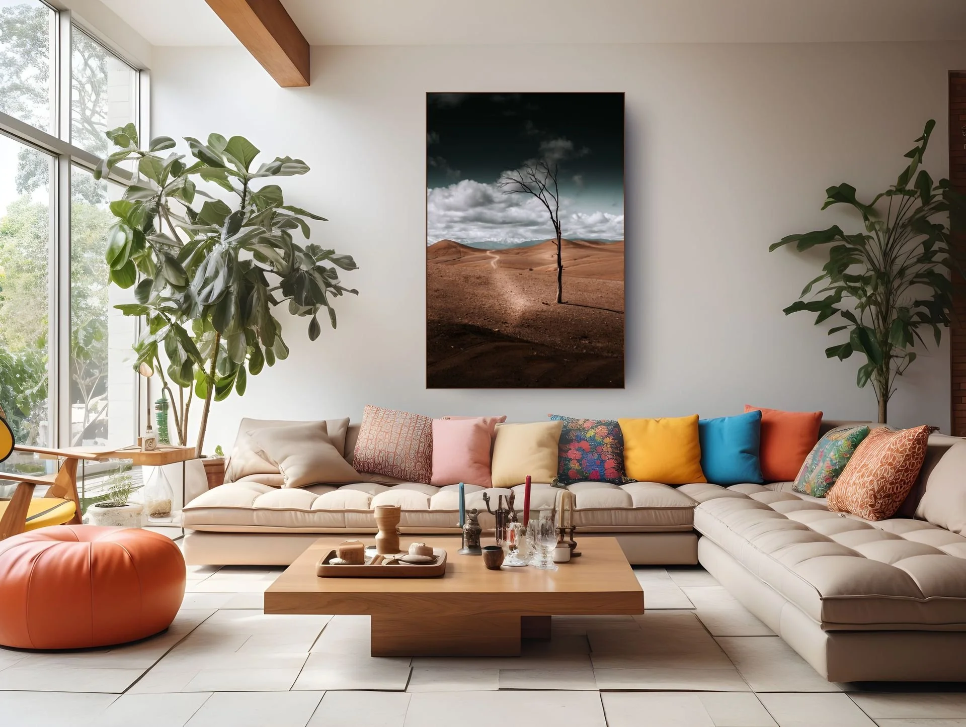
None of these are strict rules — they're a starting point when you're staring at forty options and don't know where to begin.
Size and placement still decide the final feelEven the right subject in the wrong size reads as a mistake. A large, empty wall with a small print looks like an afterthought. A bold statement photo squeezed into a narrow hallway feels cramped rather than striking. Subject and style get you the right kind of piece — size and placement are what make it actually land in the space. (More on that in the next post.)
The short version
Pick the mood of the room first, then the subject that matches that mood, then let your interior style narrow the shortlist. Color is the last filter, not the first — it's easy to get right once the subject and mood are already correct.
Looking for a piece that fits your space? Browse Wildlife, Landscape, Black & White and Flowers — or explore our style guides for Japandi, statement wall art, and more.
Acrylic, Aluminium Dibond, or Canvas: Which Material Suits Your Photo Print?
Acrylic, aluminium dibond or canvas? What each material does for a photo print, and how to choose the one that suits your photo and your room.
There's nothing quite like finding the perfect photo for your wall. Maybe it's a quiet landscape you can lose yourself in, or a powerful wildlife shot: a good print genuinely changes a room. But just as important as the photo itself is the material you print it on. And that's where I see people get it wrong more often than not.
I get this question all the time from buyers on the fence: "Erwin, what should I actually go for? Acrylic, aluminum dibond, or canvas?" The honest answer is that it depends less on personal taste and more on where the photo will hang and how much light hits that wall. Pick the wrong material for a sunny room, and you'll end up looking at reflections instead of your photo. To help you figure out which material fits your print, here's what I've learned from working with all three.
Why the Material Matters as Much as the Photo
As a photographer, I put a huge amount of care into composition, light, and fine detail. Once a photo is on your wall, you want every one of those details to come through exactly the way I saw them through the lens.
Light plays the lead role here. A glossy material on a wall that gets sun all day can turn into a mirror — you end up looking at the reflection of your window instead of the image itself, which is a shame for a print you love. On the other hand, a material like acrylic really comes alive in a shaded corner, where that depth can shine without competition. So the real question isn't "which material is best," it's "which material is best for your wall."
Photo Print on Acrylic: Depth, Gloss, and a Luxury Finish
Acrylic prints (also called acrylic glass or plexiglass) are stunning in person. The photo is mounted directly behind a thick, clear sheet of acrylic glass (plexiglass), so light passes through it and gives the image real depth. Colors pop off the wall, and dark areas turn rich and deep. It has that luxury feel you see in galleries and museums, which is why I reach for it often with my more colorful landscape work.
The one thing I always flag for buyers is light exposure. Acrylic is prone to glare. Hang it directly across from a large south-facing window, and during the day you'll mostly see the window frame reflected back at you. In a room with indirect daylight, or under directional spotlights, that same material comes fully to life.
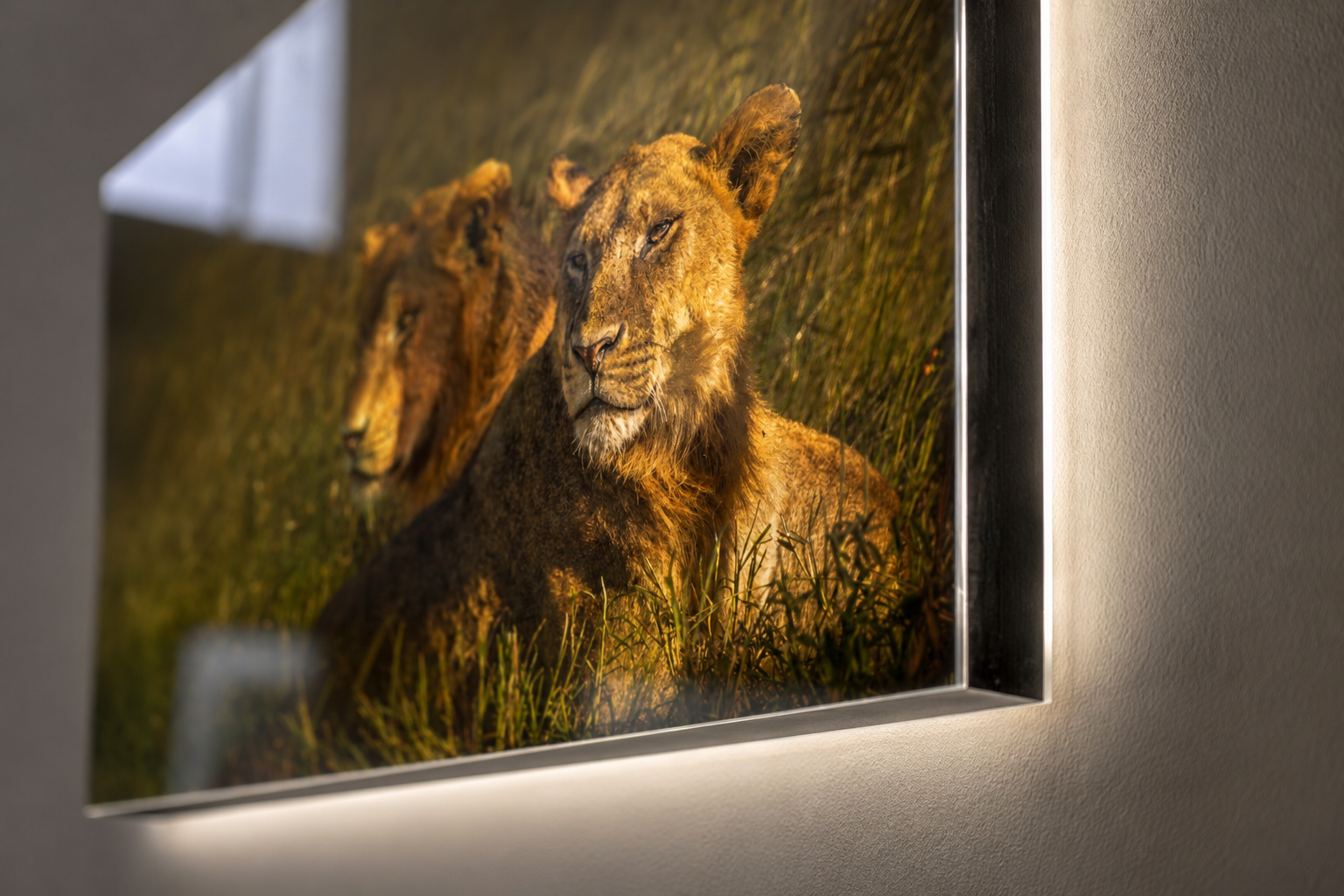
Close-up finished acrylprint
Effect: maximum color intensity, depth, and a gallery feel
Best for: walls with indirect daylight, or spotlit rooms
Ideal subjects: rich nature photography, colorful landscapes, and fine detail
Watch out for: avoid a wall directly facing a large south-facing window
Wondering if acrylic suits your image? Browse the landscape photography that works especially well on this material.
Photo on Aluminium Dibond: Sleek, Matte, and Glare-Free
Aluminium dibond is my personal favorite for a lot of my own work, especially black and white photography. The panel is made of two thin aluminum layers with a solid core in between. The finish is matte, rigid, and looks incredibly clean on a wall.
Where acrylic lives off light, dibond is the answer to it. It doesn't reflect at all. Wherever you're standing in the room, and however bright the sun gets, the image stays calm and sharp. That makes it the go-to choice for rooms with a lot of glass — think a living room with a bay window, or an office with a full glass facade. Black and white images take on a strength and character on aluminium that no other material quite matches, without ever feeling cold or corporate.
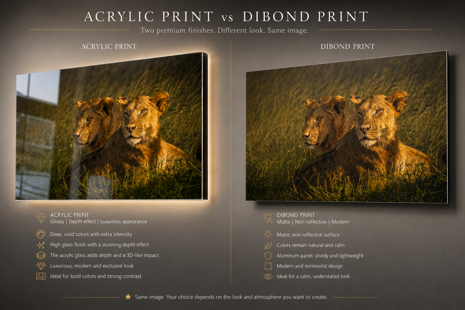
Same lion photograph on acrylic (left) and aluminum dibond (right) — same image, two very different finishes.
My black and white work and wildlife portraits come out best on this material.
Photo Print on Canvas: Warm, Atmospheric, and Classic
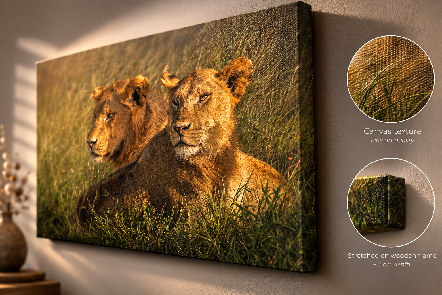
Canvas is the classic everyone knows: a print on cotton or linen fabric, stretched tightly over a wooden frame. The light texture of the fabric gives the print a softer, warmer feel than acrylic or aluminium. It doesn't reflect, and it brings a sense of warmth into a room almost instantly, making it a great fit for a farmhouse, Scandinavian, or classic interior.
One thing to keep in mind: the texture of the fabric softens very fine detail slightly. For an atmospheric landscape or a gentle nature shot, that's actually a plus, it reinforces the painterly feel. If a photo's strength lies in sharp, small details, I'd point you toward aluminium or acrylic instead.
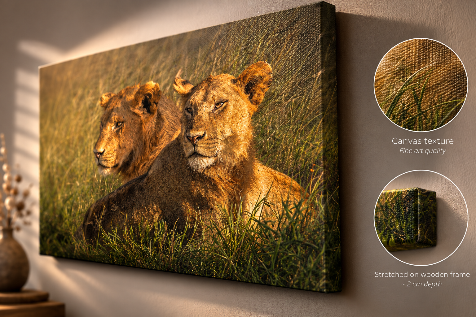
Effect: a warm, soft, painterly texture
Best for: farmhouse, Scandinavian, or traditional interiors
Ideal subjects: atmospheric landscapes and softer nature scenes
Watch out for: less suited when sharp detail is the main draw
For this softer feel, my landscape collection works especially well on canvas.
Quick Overview: Which Material Suits Your Wall?
Acrylic — Luxurious, deep, and glossy · Prone to glare · Best for colorful landscapes & fine detail
Aluminum Dibond — Sleek, matte, and modern · No reflection · Best for black and white photography & bright rooms
Canvas — Warm, soft, and classic · No glare · Best for atmospheric nature scenes & farmhouse interiors
Frequently Asked Questions About Material Choice
-
Acrylic is a thick, clear sheet of acrylic glass (plexiglass) with the photo mounted directly behind it, which creates depth and gloss. Aluminum dibond is a matte aluminum panel that has no gloss or reflection at all. In short: acrylic goes for impact, dibond goes for calm.
-
It can, especially if the print hangs directly across from a large window. With indirect light or spotlighting, this is rarely an issue in practice, and the depth effect comes through fully.
-
Aluminum dibond. It doesn't reflect, so even in a room full of windows, the photo stays clearly visible throughout the day.
-
Aluminum dibond. The matte, clean finish gives black and white images extra character and depth, with no competition from reflections.
-
That depends on the light in the room, not just personal taste. Lots of direct sunlight: go matte (dibond). Little direct light or spotlighting: gloss (acrylic) will come into its own.
Walk into almost any office and you'll usually see one of two things: bare white walls, or a motivational poster with an eagle and a quote about "success." Both miss the same thing — a reason to look twice.