
Calm Beats the Standard Poster
Walk into almost any office and you'll usually see one of two things: bare white walls, or a motivational poster with an eagle and a quote about "success." Both miss the same thing — a reason to look twice.
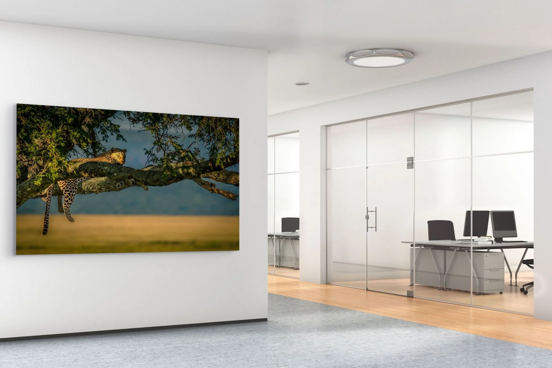
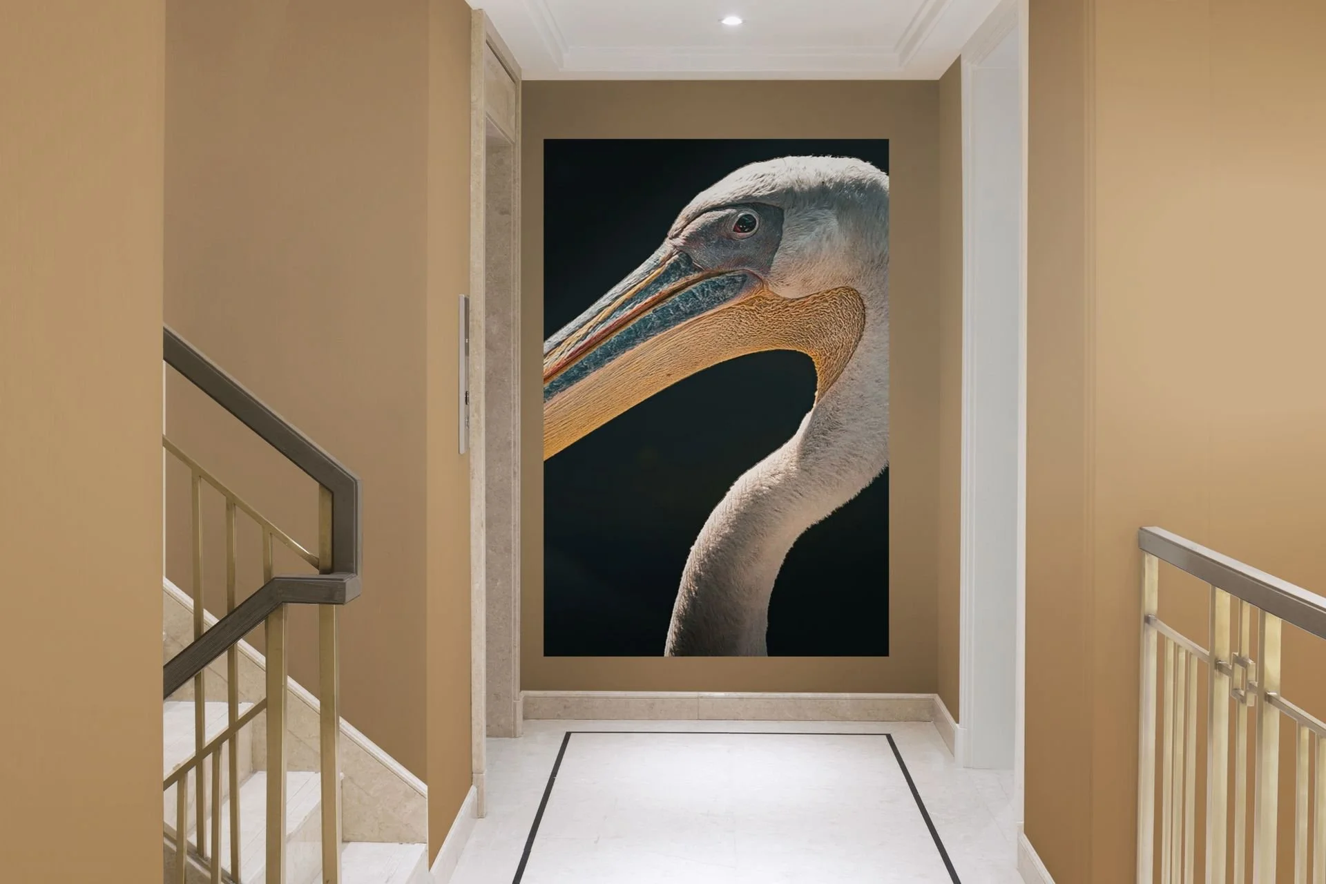
A calm, natural subject sets the tone the moment clients walk through the door.
More and more businesses are choosing something else instead: nature photography and calm, atmospheric imagery on the wall. Not because it's trendy, but because it works.
Why Nature Imagery Belongs in the Workplace
Research into biophilic design — the idea that people function better in spaces that reference nature — has shown for years that calm, natural imagery contributes to lower stress and better focus. For an office, that's directly relevant: less distraction, a more pleasant atmosphere for employees, and for visitors or clients, a space that leaves a stronger impression than a standard fit-out.
This isn't about grabbing any landscape poster at random. The right choice depends on the type of space.
Which Style Fits Which Office
Minimalist or Japandi Office
Clean lines, little color, lots of white and wood. Here, a black-and-white landscape or a quiet botanical close-up works best — subtle, with nothing competing with the interior.
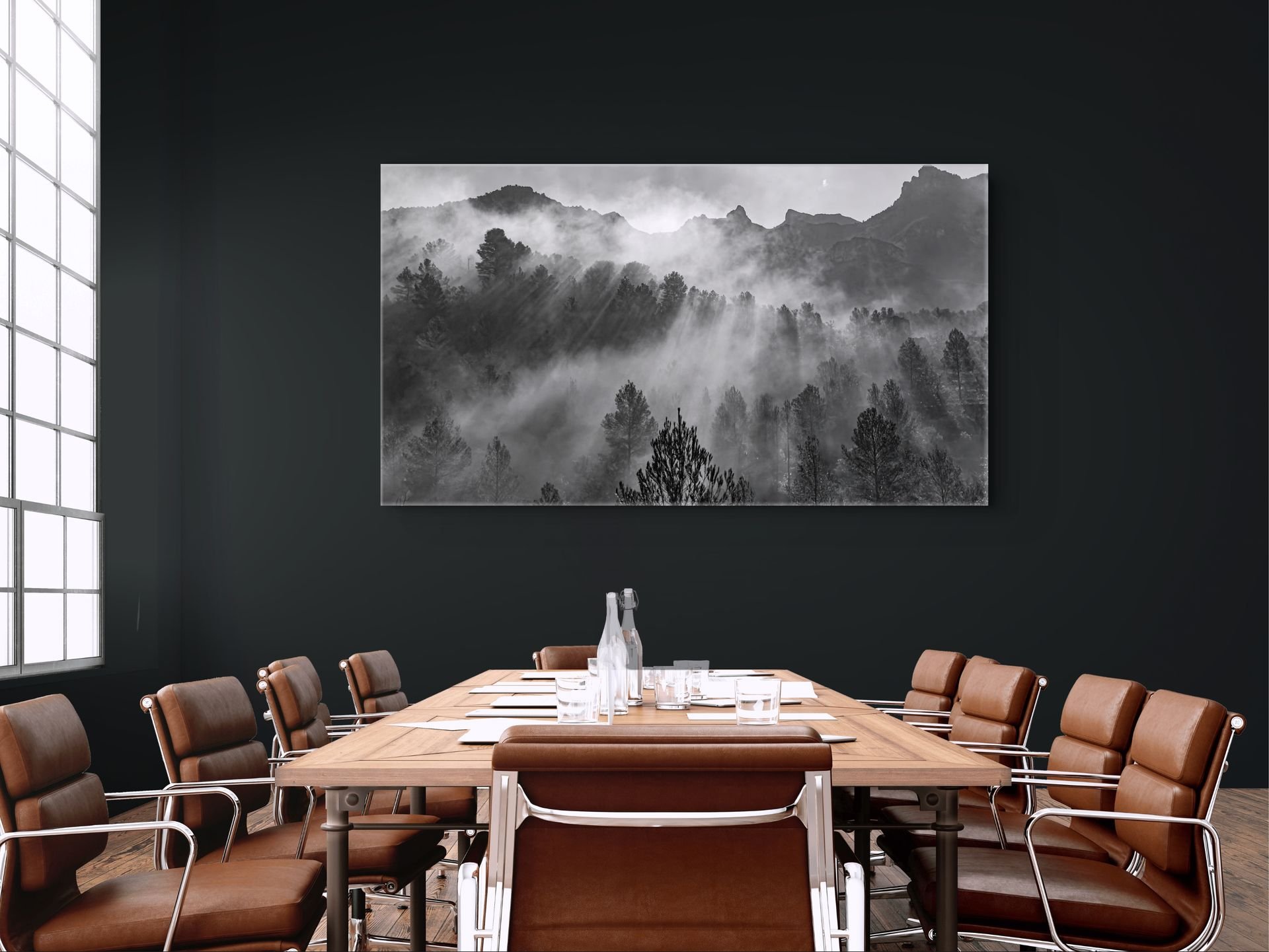
A calm black-and-white landscape suits a minimalist or Japandi-style meeting room.
Creative or Open-Plan Workspace
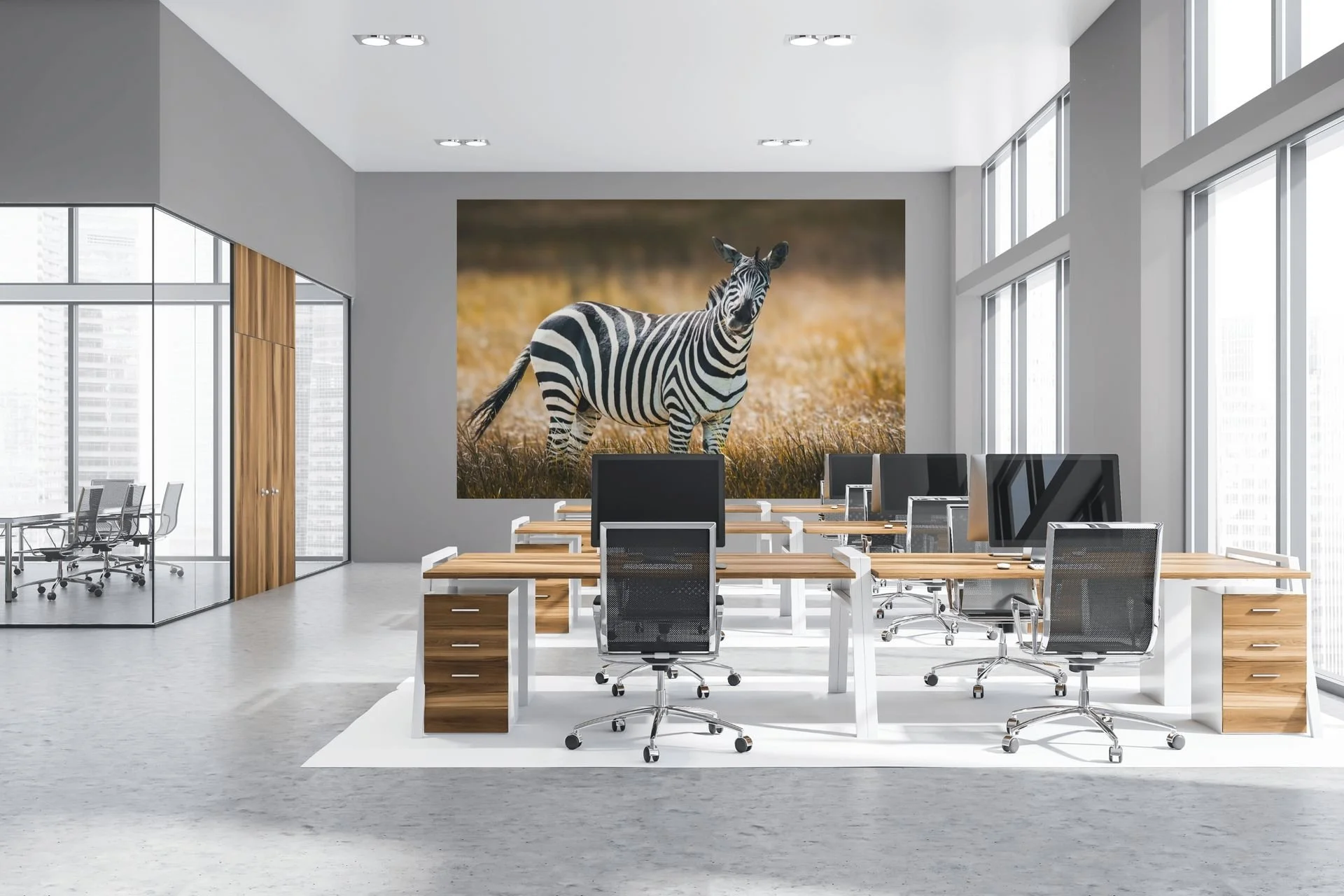
A zebra print adds color and personality to an open-plan office without disrupting focus.
More room for color and a statement piece. Think of something more abstract, or a print from an AI fine art series — something that sparks a conversation without disturbing the calm. Check our Statement Wall Art Page for more information.
Reception or Waiting Area
This is where large format makes the difference. One calm subject — a mountain landscape, water, a forest scene — in a large size has more impact than three small prints side by side.
Size and Placement
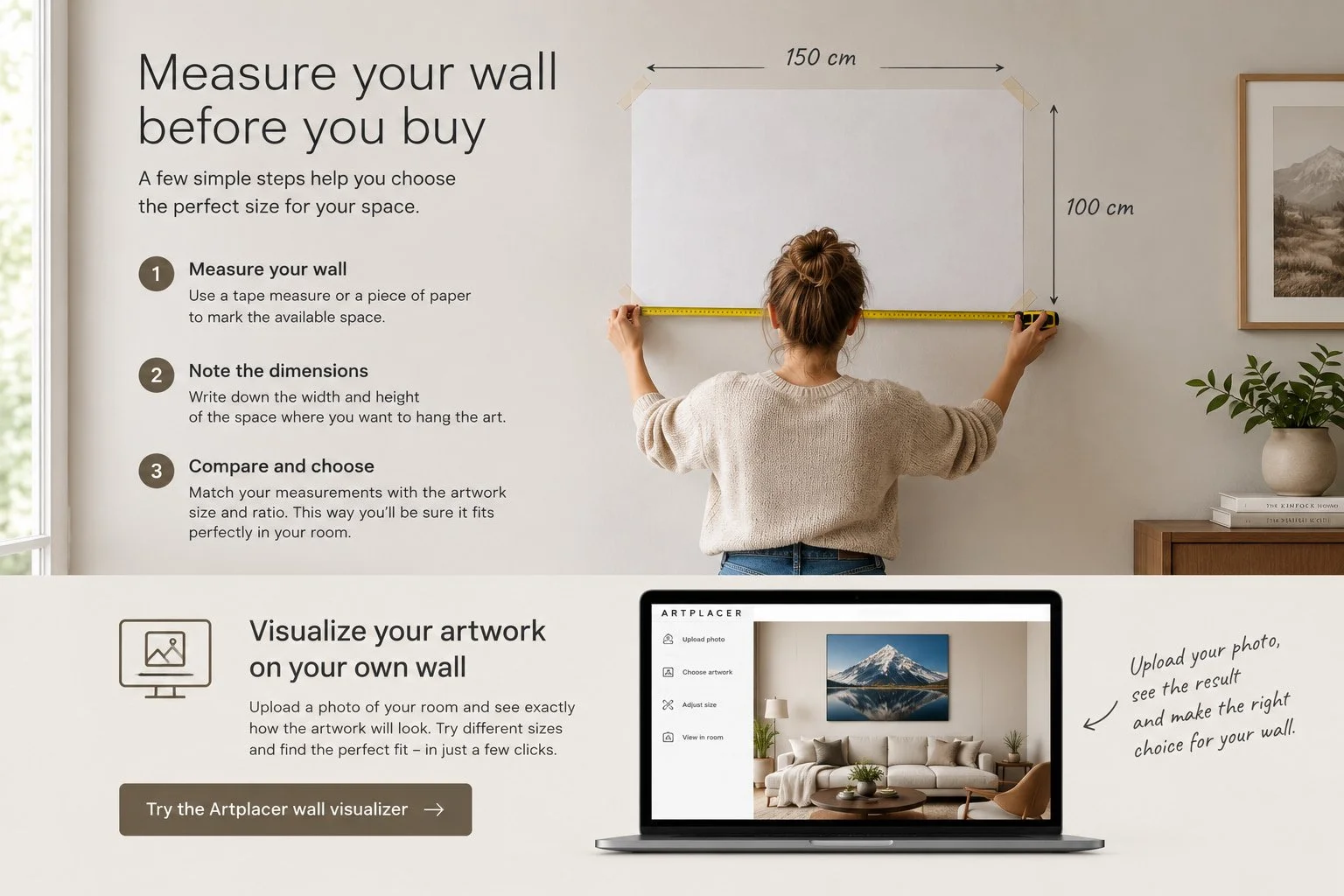
The same rule of thumb that applies at home largely applies at the office: a print should be large enough to fill the wall, not just "hang on it." Above a sofa or waiting bench, hang a print at the eye level of someone seated. In a meeting room, you can go larger and more dominant, since the viewing distance is greater.
Choosing the Right Material — Not Just Looks, but Maintenance
Offices deal with different conditions than homes: more foot traffic, more dust, sometimes more light through large windows. A print on aluminum (dibond) or acrylic is often a better choice than canvas — easier to clean, less prone to fading in sunlight, and the finish looks a touch sharper and more professional.
Why a Limited Edition Print Makes a Difference
An office poster feels like an office poster. A limited edition print — with a certificate and an edition number — feels like a deliberate choice. For businesses that host clients, and for architects and interior designers, that's often exactly the point: it signals that thought went into the space, rather than "we needed something on the wall."
In Short
The right wall art for an office isn't about adding decoration — it's about making a choice that fits the space, the people working in it, and the impression you want to leave on whoever walks through the door. Calm and nature tend to work better than clutter and clichés.
Looking for the right print for your office or practice? Get in touch for tailored advice, or browse the collection.


Walk into almost any office and you'll usually see one of two things: bare white walls, or a motivational poster with an eagle and a quote about "success." Both miss the same thing — a reason to look twice.