
Browse by category: Black & White · Landscape · Wildlife · Flowers ·
How to Choose Wall Art That Actually Fits Your Room
You found a photo you love. Now the real question is whether it fits your room. How to think it through, starting with the mood of the space.
You've found a photo you love. Now the real question: will it actually work on your wall?
This is the part people get stuck on — not whether they like a piece, but whether it fits the room. Here's how to think it through.
Start with the mood of the room, not the photo
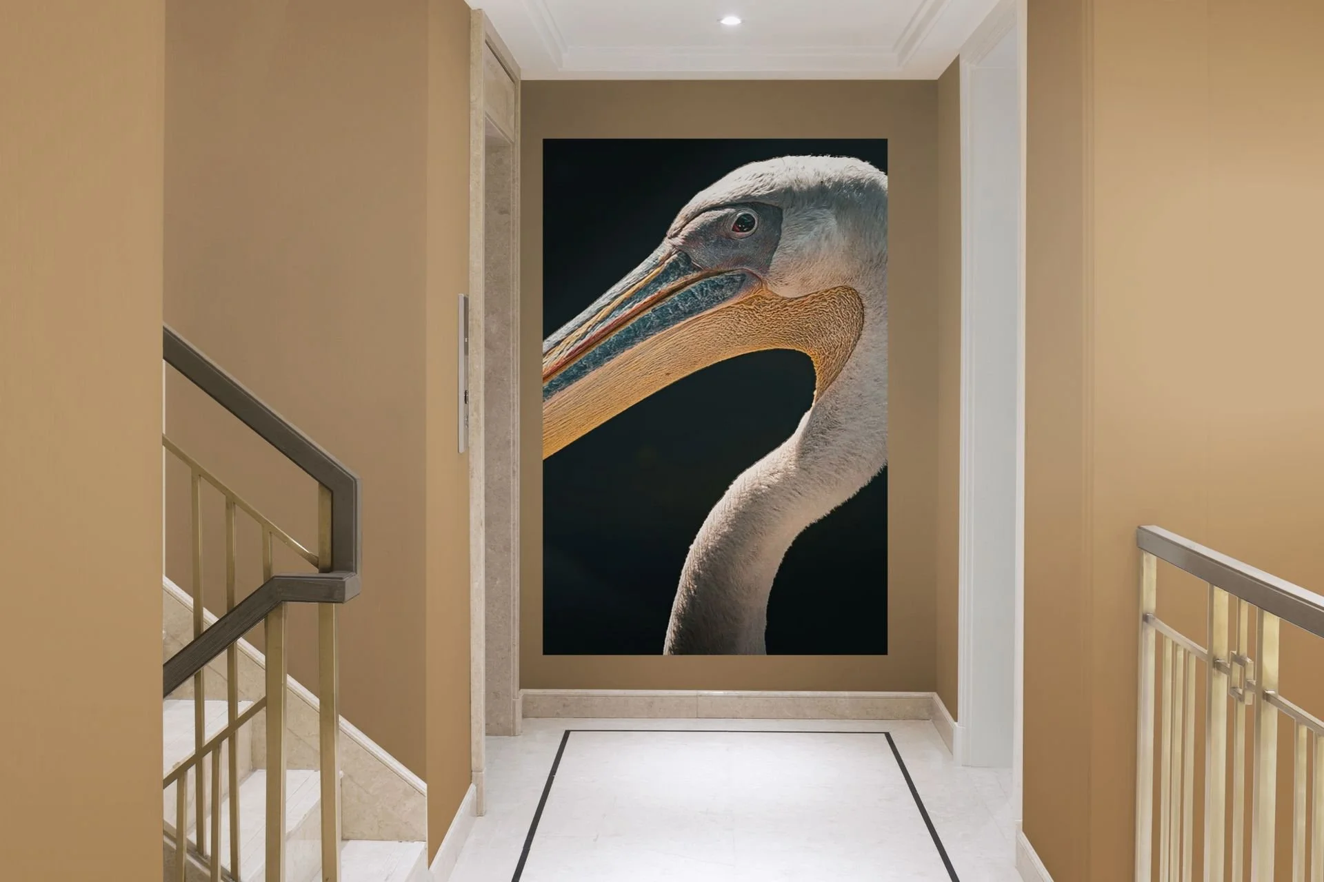
Before you fall for a specific image, look at the room itself. Is it calm and quiet, or busy and lived-in? A minimalist bedroom with soft, neutral tones asks for something equally restrained — a misty landscape, a single tree in fog, a black and white study. Drop a high-contrast wildlife close-up into that same room and it fights everything around it, even if it's a beautiful photo on its own.
A living room with more personality — warm woods, layered textures, a bit of clutter and life — can carry bolder work. A dramatic sky, a sharp animal portrait, something with more energy and contrast.
The rule of thumb: quiet rooms want quiet images, busy rooms can handle bold ones. Mismatch the two and even great photography looks out of place.
Match subject to function, not just color
It's tempting to pick art purely by color — "this teal works with my sofa." Color matters, but subject matters just as much, because different subjects create different feelings in a room.
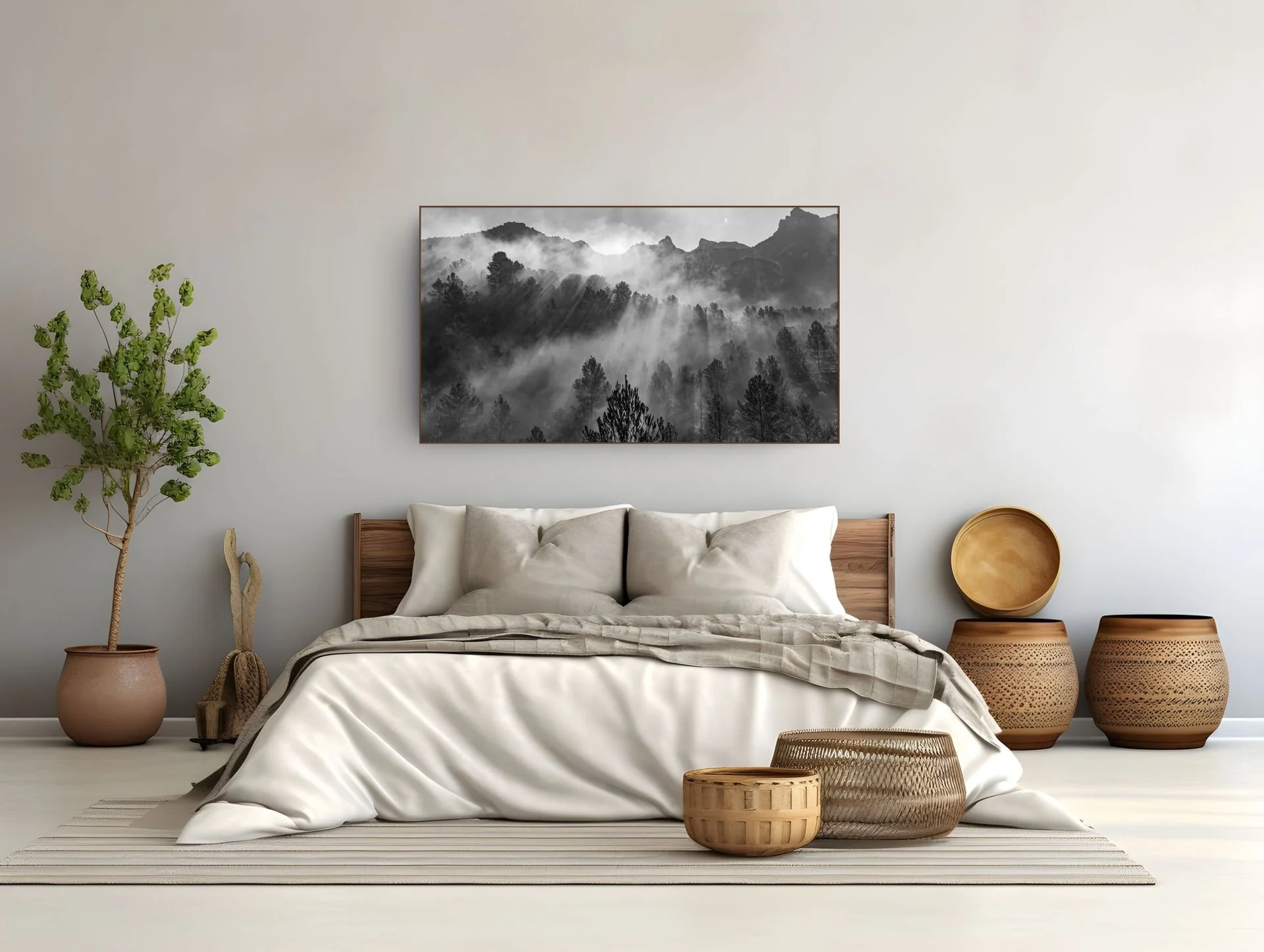
Bedrooms benefit from stillness: fog, water, minimal landscapes, soft black and white. You're not trying to impress guests here, you're trying to wind down.
Living rooms and entryways can take a statement piece — something with drama or scale that gives visitors something to look at.
Home offices often do well with subjects that feel focused rather than chaotic: architecture, clean landscape lines, structured compositions.
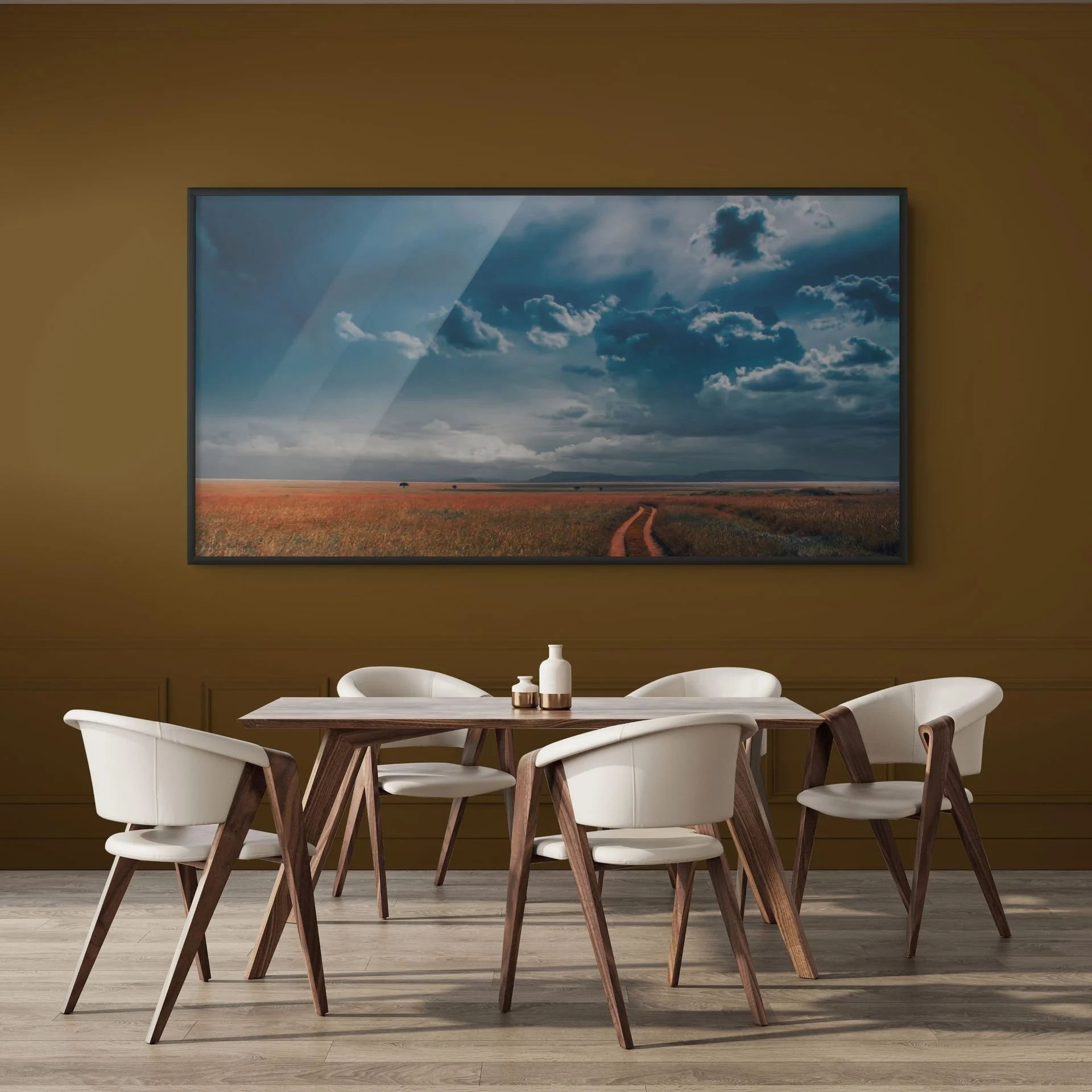
Dining areas can lean warmer and more textural, especially with black and white or earthy landscape tones that don't compete with the table itself.
Interior style is a shortcut, not a rulebook
If you know your interior style, it narrows the choice fast:
Japandi / minimalist — muted tones, negative space, black and white or soft landscape work. Nothing shouting for attention.
Scandinavian — light, airy, high-key images; snow, fog, pale skies.
Industrial / loft — bigger prints, more contrast, wildlife or architecture with strong lines.
Traditional / classic — timeless subjects, balanced compositions, warmer tones.
Eclectic / maximalist — this is where a bold, characterful photo can actually be the star of the room rather than something that needs to blend in.
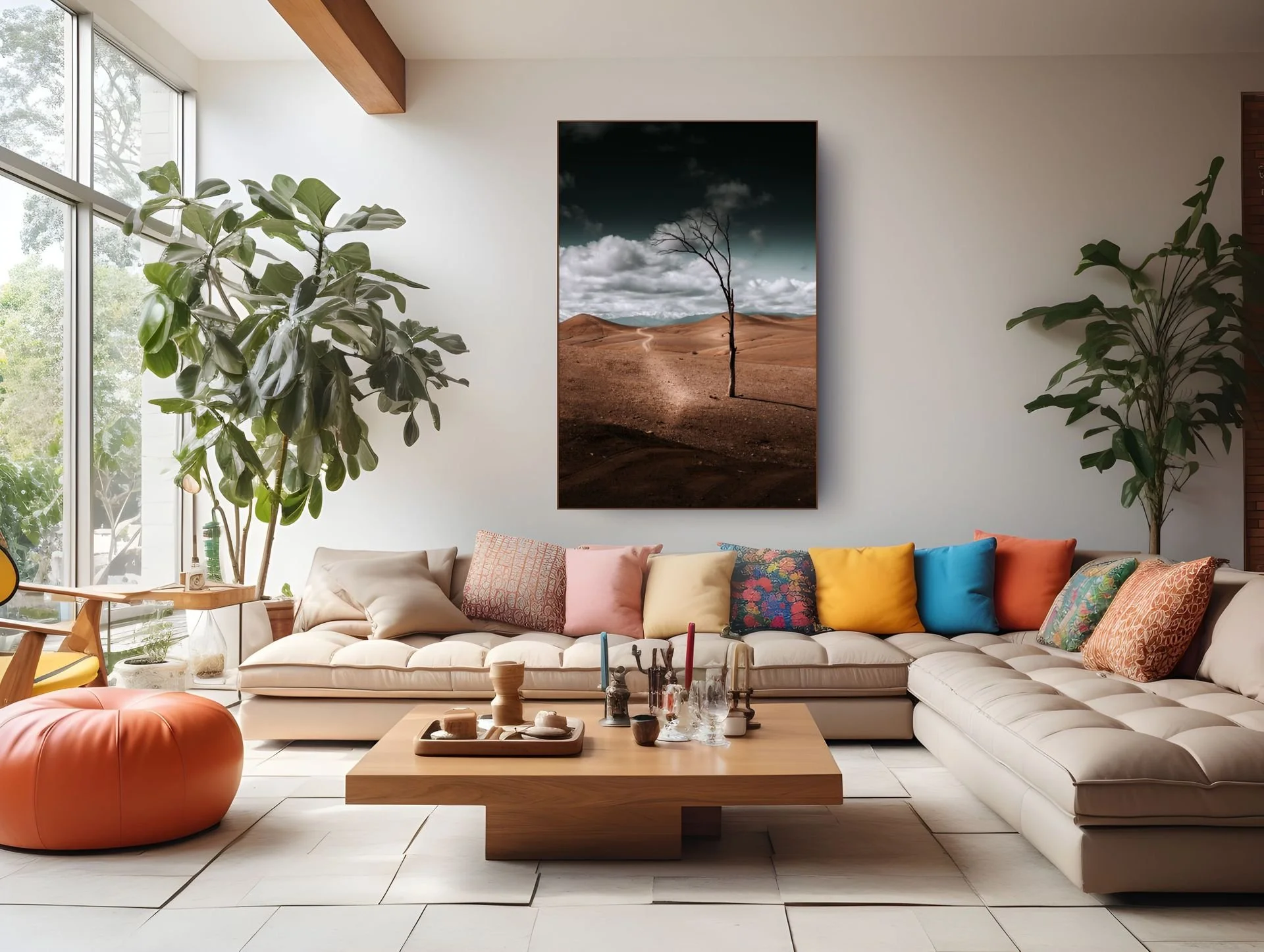
None of these are strict rules — they're a starting point when you're staring at forty options and don't know where to begin.
Size and placement still decide the final feelEven the right subject in the wrong size reads as a mistake. A large, empty wall with a small print looks like an afterthought. A bold statement photo squeezed into a narrow hallway feels cramped rather than striking. Subject and style get you the right kind of piece — size and placement are what make it actually land in the space. (More on that in the next post.)
The short version
Pick the mood of the room first, then the subject that matches that mood, then let your interior style narrow the shortlist. Color is the last filter, not the first — it's easy to get right once the subject and mood are already correct.
Looking for a piece that fits your space? Browse Wildlife, Landscape, Black & White and Flowers — or explore our style guides for Japandi, statement wall art, and more.